LOGO
 The company's initials, BS, were expressed using the most basic shapes, squares and circles. It symbolizes a company with strong fundamentals, and at the same time, it symbolizes that the best products come from strong fundamentals. The beauty of the structure can be seen through the geometric shapes, and it effectively expresses BS Research's original technology and business areas.

SPACE
- Minimum space around the logo
The logo should always be placed in a prominent location so that it is clear and visible. All BS Research signs and advertisements, including printed and electronic products, must always feature the company logo. There should always be enough space around the logo to give it its full strength and clarity. The minimum amount of empty space is directly proportional to the size of B and should not be changed.
COLOR
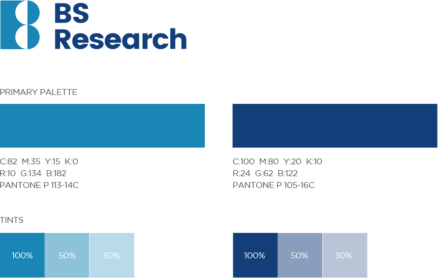
- Colors — primary palette
When applying color to various media, the exact color value used in the logo must be expressed as is. Colors can be used in three types: CMYK, RGB, and PANTONE. Unless there are exceptional cases such as an intended campaign, colors other than those specified should not be changed.
DOWNLOAD